

From research to design: creating Care Teams, a feature that gives clinicians clarity on patient assignments and streamlined team communication.
symplr Clinical Communications is a healthcare communications App whose goal is to enhance care delivery with integrated team communication. It seeks to unify care teams with a scalable, role-based communication solution that drives efficiency and elevates patient care.
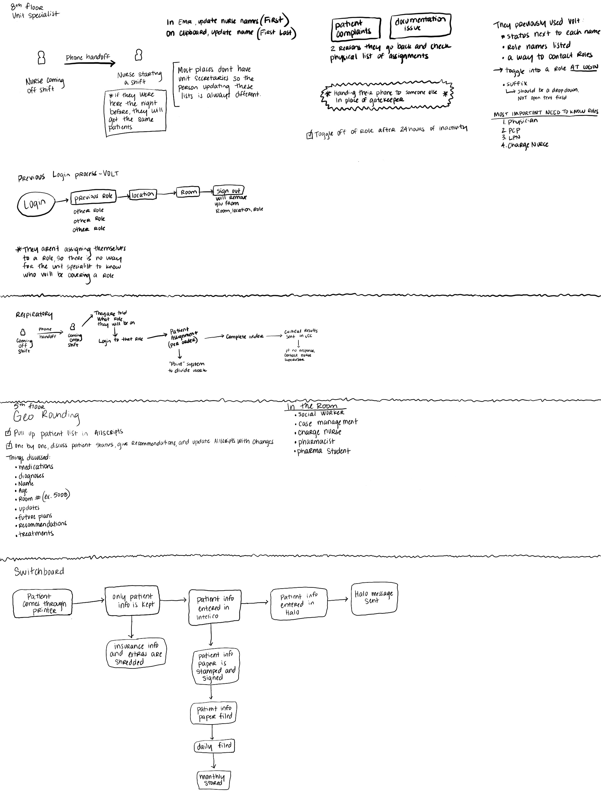
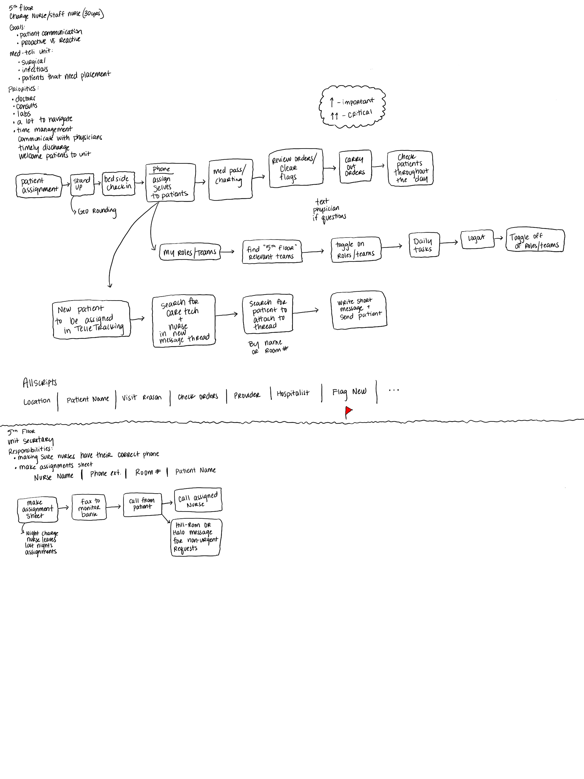
Care Teams was designed to help clinicians easily understand which patients were assigned to which care teams, and which care team members were connected to each patient. The feature also provided an efficient way for team members to communicate and collaborate. Since this was a brand-new feature, we began with user research to validate the need and uncover how we could design the best possible user experience.
Clinicians lacked a streamlined way to view patient-to-care team assignments and to communicate efficiently with other care team members. Without a centralized feature, care coordination was fragmented, leading to inefficiencies, communication gaps, and added cognitive load for clinicians.
1. Create approachable, team-wide learning opportunities around UX, accessibility, and design best practices.
2. Provide clear, adaptable tools and processes that supported both product and engineering.
3. Make design reviews more engaging, less intimidating, and ultimately more effective.
4. Ensure that early product discussions considered user experience from the start.

Since this was a brand-new feature, we began with user research to validate whether it was truly needed. Through clinician interviews and workflow observations, we confirmed that fragmented communication and unclear team structures were major pain points. Insights from this research helped us define requirements and shape the feature design.


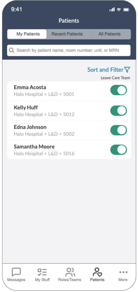
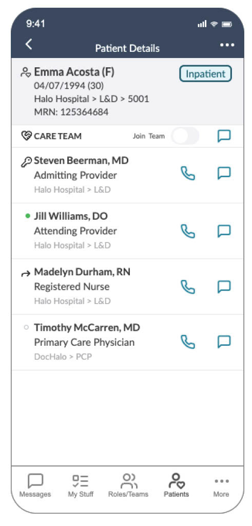
The Care Teams feature provided clinicians with a centralized view that displayed patient-to-care team relationships and allowed care team members to connect directly with one another. By prioritizing usability and seamless integration into existing workflows, the feature reduced friction and supported more effective team collaboration.


To ensure smooth implementation, I created a final Figma file with clear developer handoff instructions. The file included:
1. Accessibility annotations with defined landmarks and ARIA labels.
2. Tab order documentation to support screen reader navigation.
3. Touch target specifications optimized for mobile use.
4. Clear redlines and component usage guidelines.
This level of documentation not only supported development but also ensured the feature met accessibility standards and worked seamlessly across devices.

Improved visibility into patient-care team assignments.
Reduced communication gaps between care team members.
Streamlined coordination, saving clinicians time and cognitive effort.
Established a foundation for future enhancements to collaborative tools within the platform.Improved kickoff alignment, reducing friction between product and design when scoping features.